
Piddle Paddle Tours
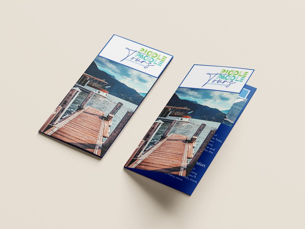
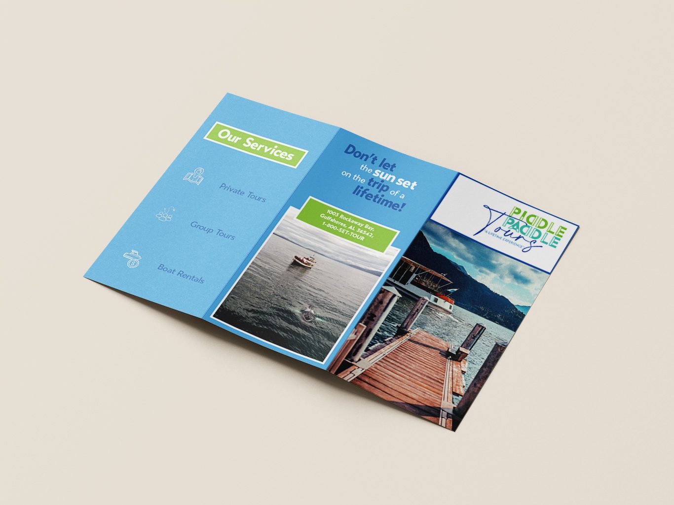
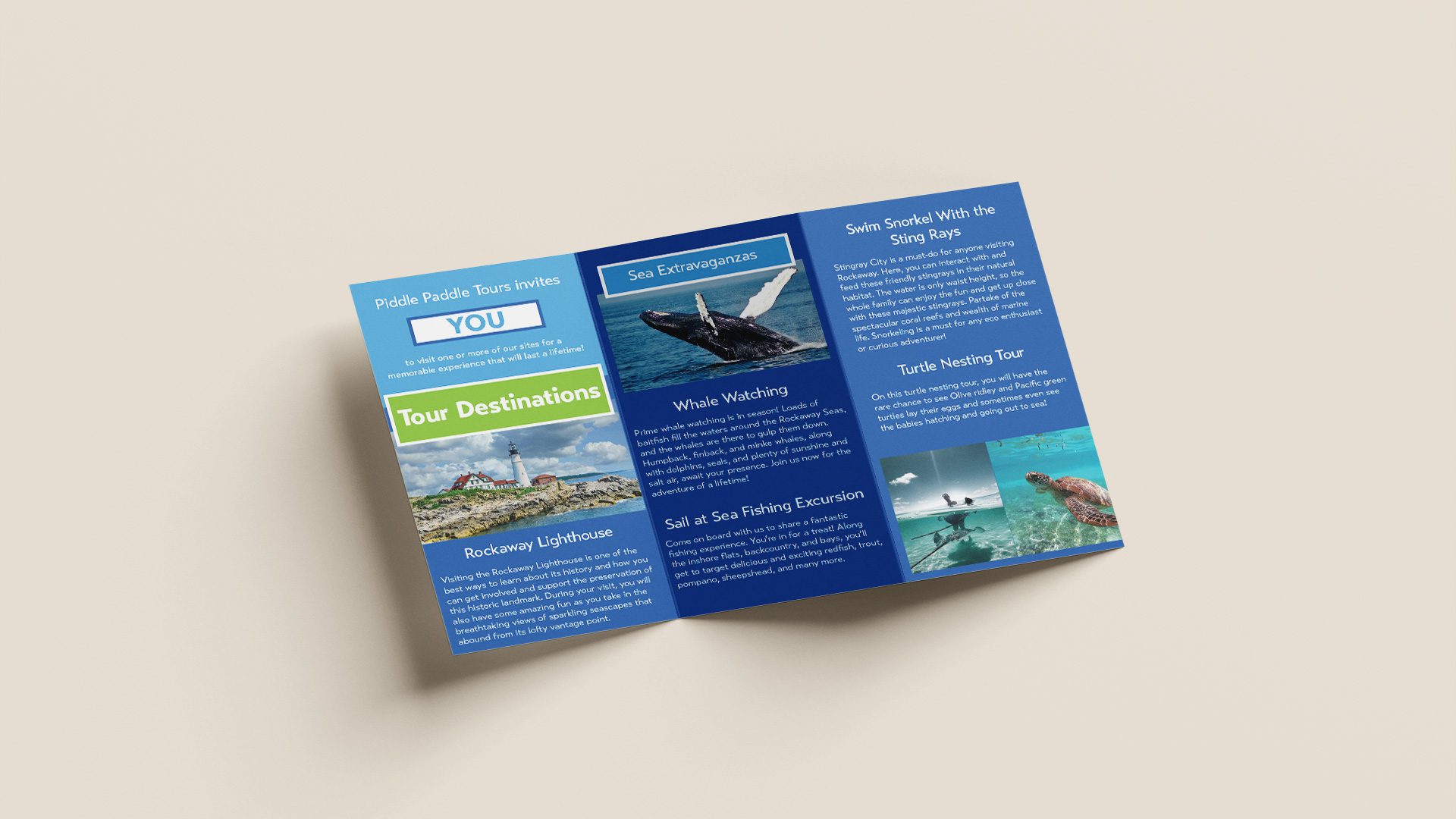
This project was for a university course on layout and publication design, where I created a brochure for a fictional local boat touring company. The main goal was for the brochure to summarize and direct travelers to buy their tours while communicating their family-friendly tone through branding. The challenge in developing this brochure was to include and organize a large amount of content while still being visually appealing and aligning with the company’s branding.
Since this company already had its own logo and style guide, it required on my part to create a brochure that translated this into an effective and cohesive design. Readability was a large factor here to organize content, so I utilized a 12-column grid system and structured panels to create a natural reading flow of a left-to-right, top-to-bottom layout. Colors and typography from the style guide were used to align with their family-friendly and open tone and were a key factor in establishing a visual hierarchy using contrasting colors and different font weights and sizes.
Once refinement for the design took place, the project was delivered via a zip file containing a print-ready PDF and editable InDesign file. The final brochure delivers a clear, organized layout that guides the viewer from introduction to services and destinations, while maintaining a cohesive and engaging visual identity.